If you’re thinking, “Do I need a whole website just to share an offer or collect sign-ups?”—good news: the answer is no! You can create a powerful landing page without a full website. Let’s walk through it together.
Whether you’re building an audience, promoting a product, or growing your email list, there are plenty of ways to design an impact-full landing page that delivers results—all without a website. And the best part is thee are many tools available using which you can create landing Page for free
Think of a landing page as a mini website with a single page and it tells to do only one action—whether it’s getting people to sign up for something, download a resource, or buy a product. Unlike a full website, landing pages are short, direct, and all about encouraging one action. They’re perfect for keeping things simple and focused!
Many people skip building a full website because creating a landing page is often faster, simpler, and more budget-friendly.
Instead of waiting to design an entire site, a landing page allows you to start sharing your offer quickly.
It’s also cost-effective, with no need for hosting fees or a designer.
Plus, a landing page helps you focus on a single goal, like gathering sign-ups or promoting a product, making it a powerful, straightforward tool for capturing attention and conversions.
You don’t need to pay for expensive tools to make a great landing page.
Here are some (free) tools you can use:
1. Google Sites: Google sites is a free tool makes it easy to set up a single-page website. You can choose from simple layouts and customize colors, text, and images. Plus, it’s connected to your Google account!
2. Canva: Known for its design options, Canva has pre-designed landing page templates. You can edit these to match your brand, then share the link or download the page as a PDF to share with others.
3. AWeber: Primarily an email marketing tool, AWeber offers landing page creation for free. You’ll get access to templates that let you create simple, effective pages that integrate with your email list.
Read More : 15 Landing page best practices to get more conversions
Now that you’ve picked a tool, let’s talk about what to put on your landing page to make it effective. Here are some must-haves:
1. Catchy Headline: Grab attention with a headline that speaks directly to your audience’s needs or interests.
2. Clear Text: Keep your message short and focused. Share the benefits of what you’re offering in simple, relatable language.
3. Eye-Catching Call-to-Action (CTA): Make your CTA stand out! Whether it’s a “Sign Up” or “Get Started,” keep it bold and easy to see.
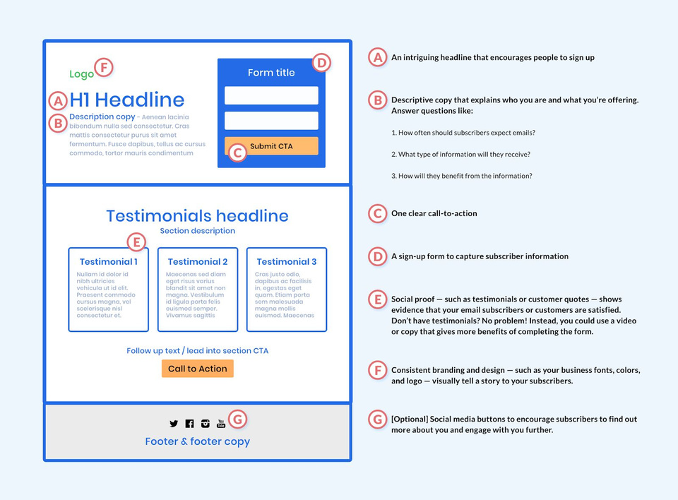
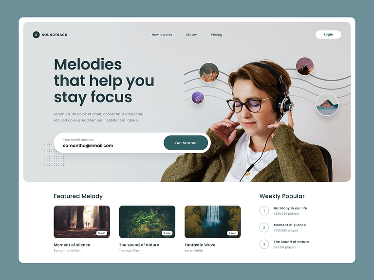
4. Visuals: Adding a high-quality image, video, or graphic can make your page more appealing and memorable.
5. Social Proof: If you have testimonials, reviews, or even logos of companies you’ve worked with, add them! Social proof builds trust and helps visitors feel more confident.
Here’s a little inspiration for you:
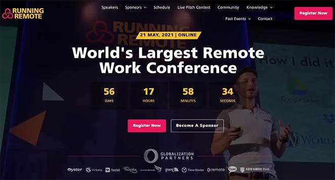
1. Event Sign-Up Page: You could create a page for a workshop with a countdown timer, a quick agenda, and a sign-up button.
2. Ebook Download: Share your latest ebook with a page that has a quick description, image of the ebook cover, and an easy download button.
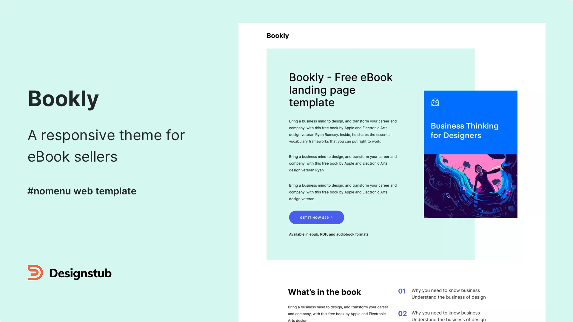
3. Newsletter Subscription: Encourage people to join your email list with a catchy headline, a quick explanation of what they’ll get, and a “Subscribe” button.
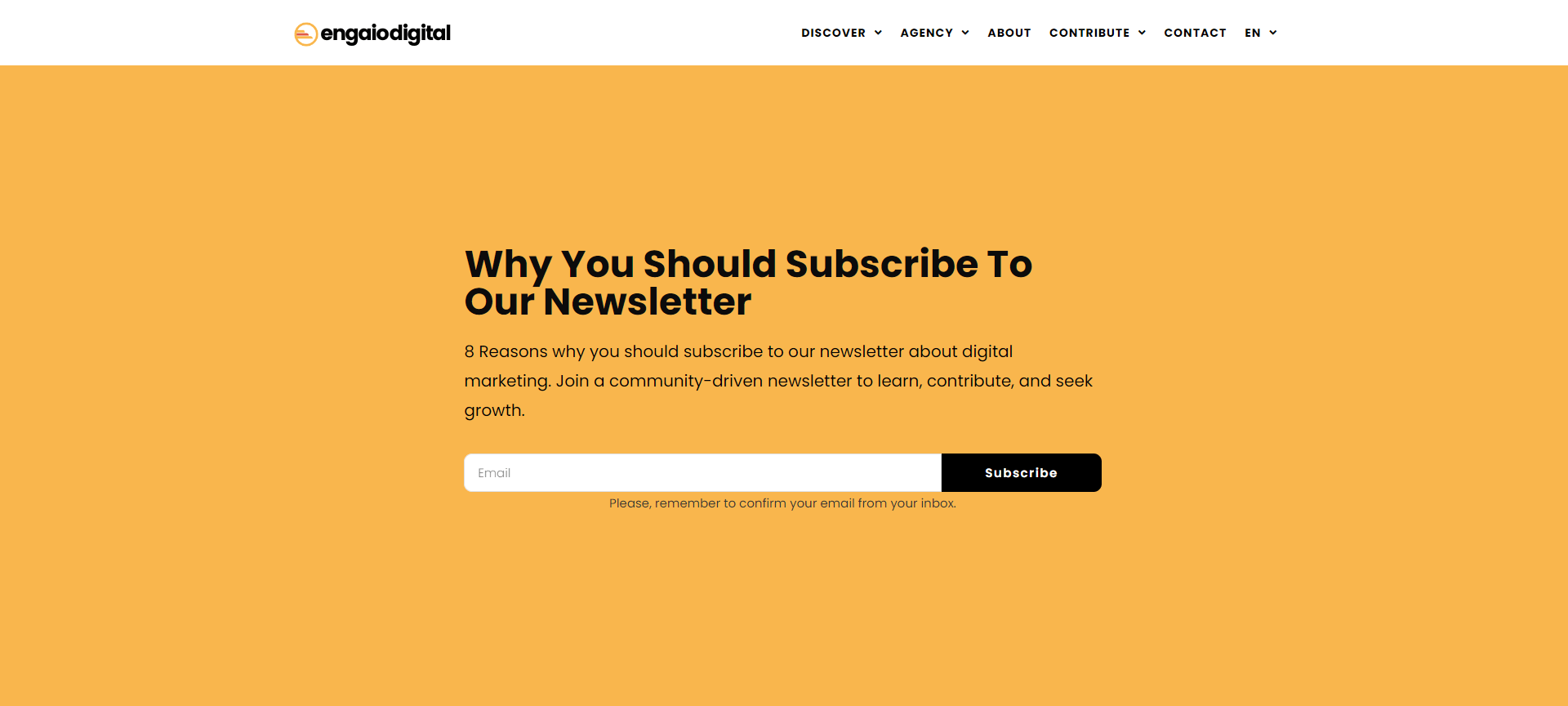
Example of Newsletter subscription Landing Page
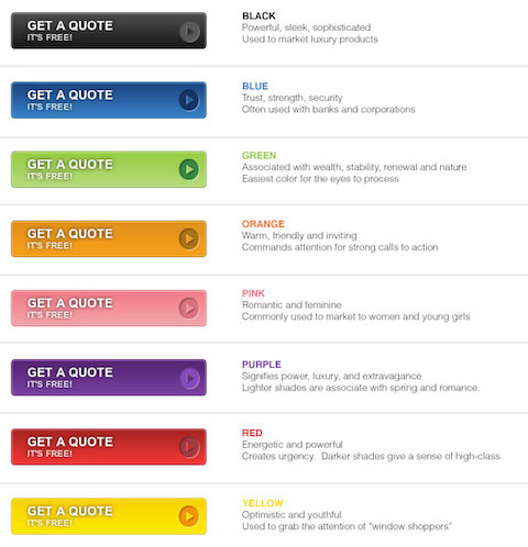
Color plays a powerful role in landing pages because it influences how people feel and behave.
Different colors evoke specific emotions: blue often creates a sense of trust and calm, while red grabs attention and can create urgency.
Using color strategically can guide visitors’ attention, highlight call-to-action buttons, and reinforce a brand’s message.
For example, warm colors like orange and red can encourage quick action, while cooler tones like green or blue feel soothing and secure.
Choosing colors that match the desired mood can significantly impact engagement and conversions.
Once it’s live, you’ll want people to see it! Here’s how:
Social Media: Share the link on platforms like Instagram, Facebook, or Twitter, Linkedin, Youtube etc .
Email: Send the link to your email list or new contacts.
Collaborations: Work with influencers or other brands to share it with a bigger audience
A landing page is a single-page website designed to capture visitors’ email addresses by offering them something valuable in return. This valuable offer, often called a lead magnet, could be a free e-book, a discount code, or even a subscription to a newsletter.
Here’s how it works: The visitor provides their email address on the landing page to access the promised offer. Once they do, their email address is added to your email list, which you’ll use for sending out email marketing campaigns.
The moment someone signs up, they typically receive a welcome email. This email should serve three key purposes:
– Thank the subscriber for joining.
– Deliver the lead magnet (the freebie or offer you promised).
– Introduce your brand, helping the subscriber get familiar with what you offer.
This simple yet effective process not only helps grow your email list but also builds a strong foundation for a lasting relationship with your audience.
The beauty of a landing page is that it doesn’t have to be complicated. Stick to one clear message and make it easy for people to take action. Using free tools and keeping your design focused, you can have a landing page up and running in no time.
Ready to give it a try? Happy creating!
Looking to level up your email marketing game? Grab free guides today and unlock proven strategies to grow your business online. Easy to understand, actionable tips—no strings attached!
